Contents
Introduction
This article provides a tutorial and some hints and tips on creating effective icons for your extensions. I’ve put the hints and tips at the beginning so you can easily refer back to them; the tutorial then follows.
Quick hints and tips
Branding and simplicity
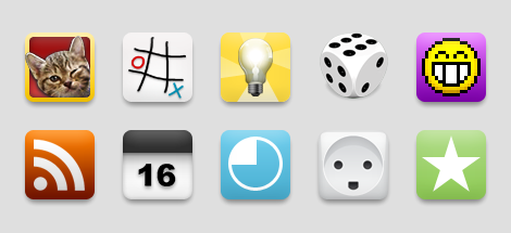
Your icon should be simple and effective, and it should reflect the style and purpose of your extension. A simple shape or letter from an interesting font works well, but detailed images and intricate fonts might not. A game will benefit from having a playful, colorful icon, whereas a more serious application may be better served by a more conservative and functional icon. For identification purposes, consider making your icon consistent with the styling and colors of your extension. Figure 1 shows some good examples.
Less is more
A unique shape or silhouette will help users to identify your extension quickly. Combining objects or shapes is generally not advised, as this tends to complicate your icon, diluting its message (see Figure 2.) Furthermore: to make the icon balance well, imagine that the shape has a physical weight. When centered on an imaginary pillar, the icon should not tip to the right or left; it should balance. Do not apply a shadow to outline shapes. Instead, put the shape on a background.

Beautiful icons
Consider getting a professional graphic designer or illustrator to help you create your icon. If you aim for realism by making an icon that represents a real life object, it is advisable to use a single light source located directly above you, in front of the object. The perspective should be either straight on for flat objects like picture frames and windows, or from slightly above — as if the object were sitting on your desk, producing a shadow directly below and behind the object. Colors help the user to identify the icon’s significance, but should not be used to grab attention. Gradients should be conservative and smooth. See Figure 3 for a good example versus some not so good ones.

Do not use system icons or other application icons in your work — see Figure 4 for some examples.

Scaling
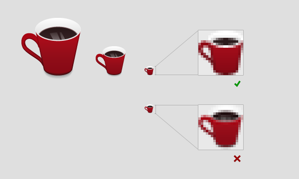
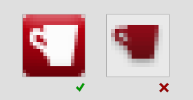
Reducing the size of a bitmap image results in a loss of information. Details will gradually disappear, and it is often necessary to simplify the icon quite a bit to make it legible. You should therefore start with the largest icon size you can and scale down to create smaller sizes — see Figure 5. Depending on the icon design, some effort should be made towards sharpening and simplifying the icons. The example in this case is not really that bad, and would pass, but the quality improves with some extra effort.
As you scale an icon down, details may end up in between pixels. Think of the pixels as a mosaic. If you need to draw a tiny dot, you cannot move the mosaic tiles to fit where you want the dot. You must either move the dot slightly, or make the surrounding tiles imply there is a dot by coloring all of them. This last approach is common to all graphics software, and it will make the dot appear blurry or unsharp. If your icon loses sharpness, you should consider redrawing it: tweak your design to align with the pixel grid or remove details to simplify the information.
Note that Interlaced PNG-files are currently not supported, due to a limitation of the image library we’re using. Avoid this effect in your screenshots.
Problems and solutions
- Horizontal and vertical lines should be aligned with the pixel grid, and look sharp.
- If the extension adds the icon to a button in the Opera UI, it should fit in visually.
- The requirement of clean lines does not imply pixel art. Angled lines or curves should be anti-aliased, unless pixel art is intended.
- If the icon disappears because it has a problematic color, it should have a frame of sorts, such as a roundrect button shape background.
- Icon shapes should fill the space allotted to them. Too much padding is not good. Consider adding a background.
Requirements
- Icons should be scaled nicely (no deformation, blurring or loss of intended details).
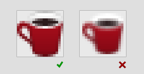
- Icon edges should be clean (no blur on straight lines and no pixeled corners).
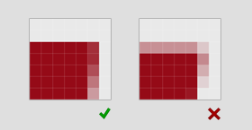
- Icons with transparent backgrounds must be centered. The icon must not conflict with the Opera UI button.
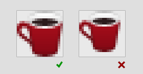
- Icons should be anti-aliased or perfectly pixelated.
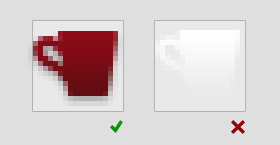
- Icons must not be completely white, and must not lose their coherence on a white background or on the Opera toolbar chrome.
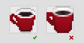
- Icons should have a background or fill the space allotted to them. They should not occupy much less than 85% of the field.
Photoshop: Icon tutorial
Note: Even though this tutorial is written with Photoshop in mind, you can still get some useful tips if you decide to use a different graphics package.
This tutorial is written with complete beginners in mind, but even Photoshop veterans may be able to pick up a thing or two.
Selecting an icon
You don’t need to be able to draw to create a good icon shape. The next best thing to drawing something unique and sexy is to cheat, and select an icon shape from somewhere like a freeware site on the Web or a icon font like the Web- or Wingdings fonts that are available on pretty much all computers, see Figure 6. For this tutorial, I am using the Wingdings letter “z”: ⌘. (Unicode: U+2318, HTML: ⌘)

The icon shape layer
After selecting the glyph you want from the Wingdings font, select the Text Tool inside Photoshop, as seen in Figure 7. And locate the Wingdings font in the font family dropdown top left in your viewport.

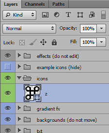
Make sure you have the green “icons” layer group selected and click anywhere outside of text areas to start writing. The easiest way to get the icon you want is to copy and paste the letter from the character palette (Figure 6) and paste it into the text box. Depending on the graphics package used, you might have to apply the Wingdings font to the text again. Figure 8 shows the font applied.
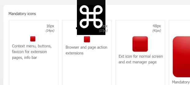
An elegant and proven way of making your icon look professional is to make the shape white on a subtle gradient colored background. Since this template is all about simplicity and pre-made backgrounds, I strongly suggest you stick with this too, for now.
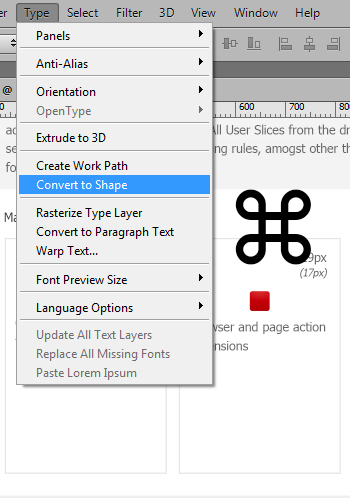
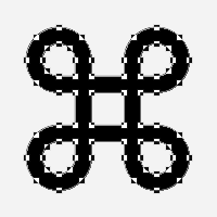
In order to tweak and properly place your icon shape, you’ll need to make it a vector shape layer. In CS6, from the Type dropdown, simply select Convert to Shape and you have an editable vector shape. (In previous versions of PS, this conversion tool has been located in the Layer menu.) You can also achieve the same result by right/Ctrl + clicking the type layer. Your letter, or in this case icon, is now no longer a text item but an editable vector shape with Bézier curve points for you to play with. Figures 9-11 show this process.
Pixel sharp vectors
Now that you have an icon that you can work with, you need to place it and make it the correct size (see Figure 12). First, drag it over the 128 px background shape with the Move Tool (V), then select Edit > Free Transform (or hit Ctrl/Cmd + T) to make it fit. Make sure you have zoomed your view (Ctrl/Cmd -+) enough to clearly see what’s going on. While you can drag the corner or side boxes of the transform selection, I recommend you use the input fields up on the tool bar instead. This will ensure you hit whole pixel values thereby giving you an overall much higher level of control.
Depending on what you have previously selected, your icon might have a color that is not good to work with. If so, change this by double-clicking the shape icon in the layer palette.
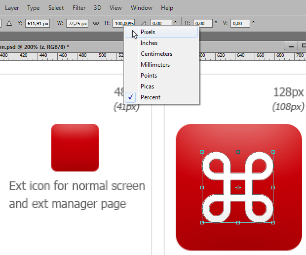
Your icon is probably not placed on a whole pixel value on the x- or y-axis — Change this now by rounding the X: and Y: values in the toolbar up or down.
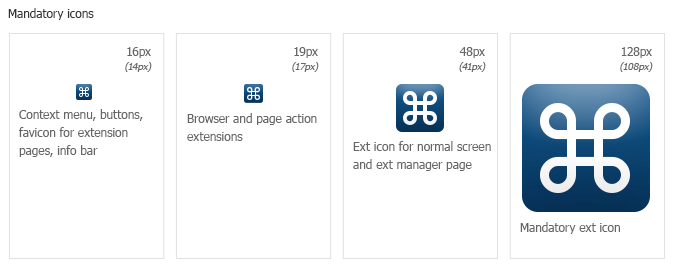
In the next fields, W: (width) and H: (height), you should also input whole pixel values. By default these fields are set to percentages, so you have to right click both of them in turn and select pixels from the dropdown. If you want to, you can click the little chain icon between the fields to maintain the aspect ratio of your icon. Do this. Round your values up to a whole, preferably even, number. In this case, we’re going for 90 px. The number in (brackets), 108 px, underneath the icon size is a maximum recommended shape size for this icon (roughly 85% of the background size). In this case we go for something slightly smaller. 90 px is a nice number. For tall or wide shapes, first scale the widest aspect to the desired size with aspect ratio locked, then release it and tweak the narrow aspect if needed. Usually pointy or curved sides can do without a perfect fit, while straight horizontal or vertical edges look better when exactly matching the pixel grid.

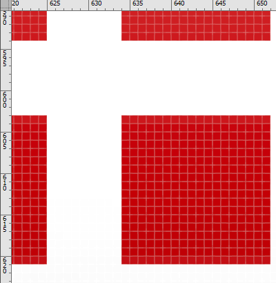
Zoom in a bit more, then look at your icon shape. It should fit the pixel grid perfectly, as seen in Figure 14. That was lucky! Let’s see what happens when we scale the icon down.
Small icons
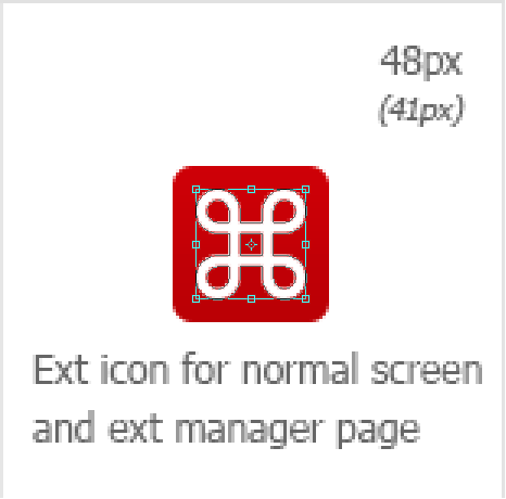
Let’s start by duplicating the icon shape layer. One way to do this is by holding down the Alt key while dragging the icon with the Move Tool active. In CS6 you will have to disable the effects layer before trying this method, or you will duplicate the linked background and effect layers instead. Next, free transform the layer shape (Ctrl/Cmd + T) to px: 34×34 px (See Figure 17).
Zoom in on that new icon shape, and you’ll see that the vector shape is fuzzy around the edges. To see the path, make sure you select the Path Selection Tool (A). Now, all vector paths cannot line up with the pixel grid — that would produce pixel art — a judgement on what to tweak has to be made. In this case, the horizontal and vertical paths almost align with the grid. It might work to nudge them a little. The resulting shape should end up slightly fatter than the original, but it might be worth it. The only way to find out is by trying.

Pixel sharp vectors, Part 2

With the Direct Selection Tool select the six vector points of the left edge of the left vertical bar (Figure 18). Nudge the points a little to the left with the arrow keys on your keyboard so they align with the pixel grid. Repeat for all the eight edges.
If for some reason you cannot select vector points, you might have another shape selected, in which case you must select your shape in the Layers Tab. This happens from time to time if you click away from the current shape.

Before we proceed, here’s a little extra tip. The built in vector pixel snapping functionality of Photoshop CS6 is sadly a bit lacking and it can behave differently from what you’d expect. If you wish to make use of grid snapping, a better method is using grid lines. First open the Preferences dialog (Ctrl/Cmd + K) and make sure Snap Vector Tools and Transforms to Pixel Grid is unchecked. Then go to Guides, Grid & Slices. Change the values for Gridline Every and Subdivisions to 10 pixels both. You can now snap to the pixel grid by viewing it (View > Show > Pixel Grid) and making sure snapping is turned on (View > Snap to > Grid).

With the Direct Selection Tool selected (the white arrow), select the vector points and move them to pixel corners. You should end up with something like this:

Now, that’s less fuzzy, but the loops are now a bit thinner and must be tweaked a little. The outer edge is fine, so we’ll just alter the four corner cut-outs. To do this it would help to reduce the number of points to move around. Less points equals less potential trouble and this shape has way more points than it needs. You can make a perfect circle with just two points, although it’s easier with four. The shapes we will deal with here are circle-like, all with one pointy corner. Let’s keep the corner point and the ones north, east, south and west, ditching the remaining three.
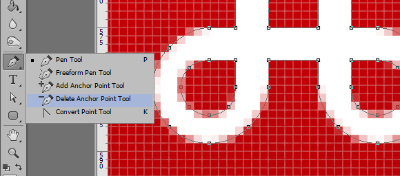
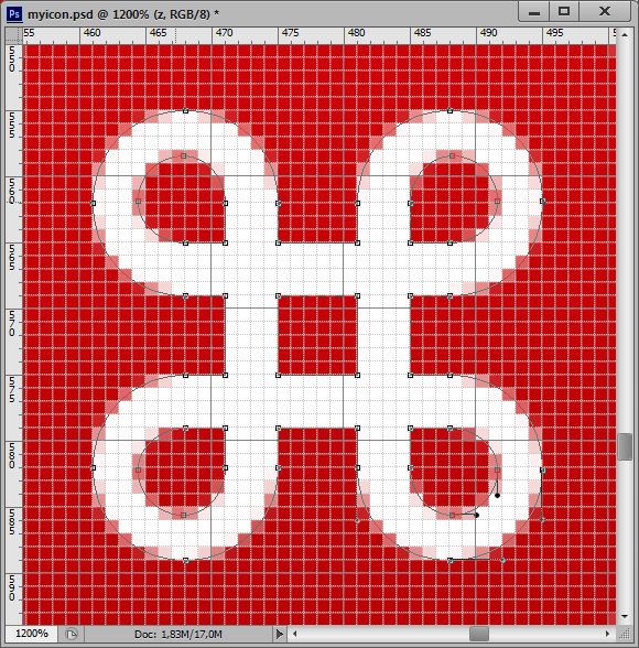
Voila! That’s easier to deal with. The eagle eyed will notice all the outer edge vector points are aligned to the grid in the above figure. This is strictly not needed, but gives relief to your inner OCD. The vector arms stretching towards the corners are similarily snapped into place.
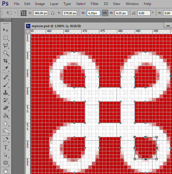
To make the loops fatter, the cut-outs must be reduced. To make them even, it’s best to use the Transform Tool on all the vector points. Select them with the Direct Selection Tool (A) and hit Ctrl/Cmd + T. Now select the little dot in the Reference point location grid on the toolbar that corresponds to the pointy part of the cut-out, in this example: the top left one. This makes the transform orienting around the top left corner of the bounding box. Next alter the width and height values to 6.25 px. Hit the Enter key when finished, and repeat for all the next corner cut-outs. Orient towards the corner vector point of the cut-outs as you go along.
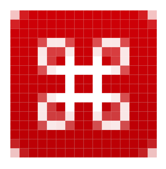
Without going into detail how to get there, here are suggestions for solving the last two tweaked shapes. As the number of pixels available is reduced, the detail of the shape naturally also gets reduced. Hence it becomes harder to make the smaller icons look nice the smaller they are. To further complicate things, one of the icons is to have an odd number of pixels along the X and Y axis. The center point has to land on a half-pixel in that case if the icon is to be centered.

The palette
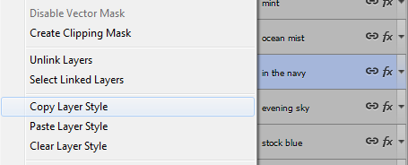
Now over to the background shapes. To make your icon interesting, it should have a nice colour, with a subtle gradient. A colour palette is provided in the template — click on the gradient you wish to try, and notice that the layer this gradient sits on has been selected in the layers panel. Right/Ctrl + click the blue area of that layer and select Copy Layer Style. Paste this gradient by selecting the background shape layers you wish to apply it to, Right/Ctrl + clicking the blue area of those layers and selecting Paste Layer Style. You can select multiple layers and have all of them affected at once if you wish.
Your icon should now look something like this and be ready for export:
Exporting the icons
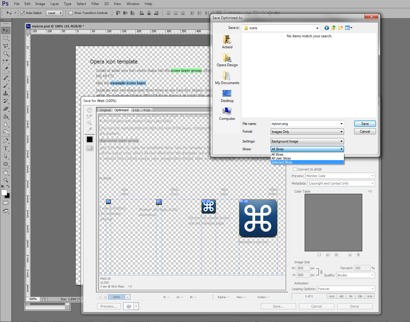
Hanging in there? This last part is very easy, as all the hard work is already done. First, simply hide the background layer by clicking the little eye icon next to it. Next click File > Save for Web & Devices… (Ctrl/Cmd + Alt + Shift + S) and select the icons you just made. Your icons might be outside the view, if so pan the viewport until you see your icons (hit the Space key and click-drag). It’s a bit hard to see what’s selected or not, but selected items get a brown border. Click Save… and give your icons a fitting name, they will all get a suffix with their individual size. Make sure to select a correct folder and select Slices: Selected Slices in the dropdown. Hit Save, and you’re done!
